Clive ‘N’ Wrench Review – Review

I think at this point I can safely say that 3D platformers are probably my favorite genre out there. There is something so fundamentally satisfying about walking around, exploring all kinds of worlds, interacting with objects and making my own way through a carefully designed level while getting more and more comfortable with the moveset at my disposal. From Neon White’s high-paced action, to the more combat-focused experience of Blue Fire, to the creativity on display in A Hat in Time, and that’s just accounting for the ones not created by juggernauts like Nintendo themselves or even Rareware back in the day. Clive ‘n Wrench truly wishes to be among those reclaiming the 3D platformers from the late 90’s and early 2000’s. But the experience leaves a lot to be desired from both a fundamental level as well as this particular version on the Nintendo Switch.
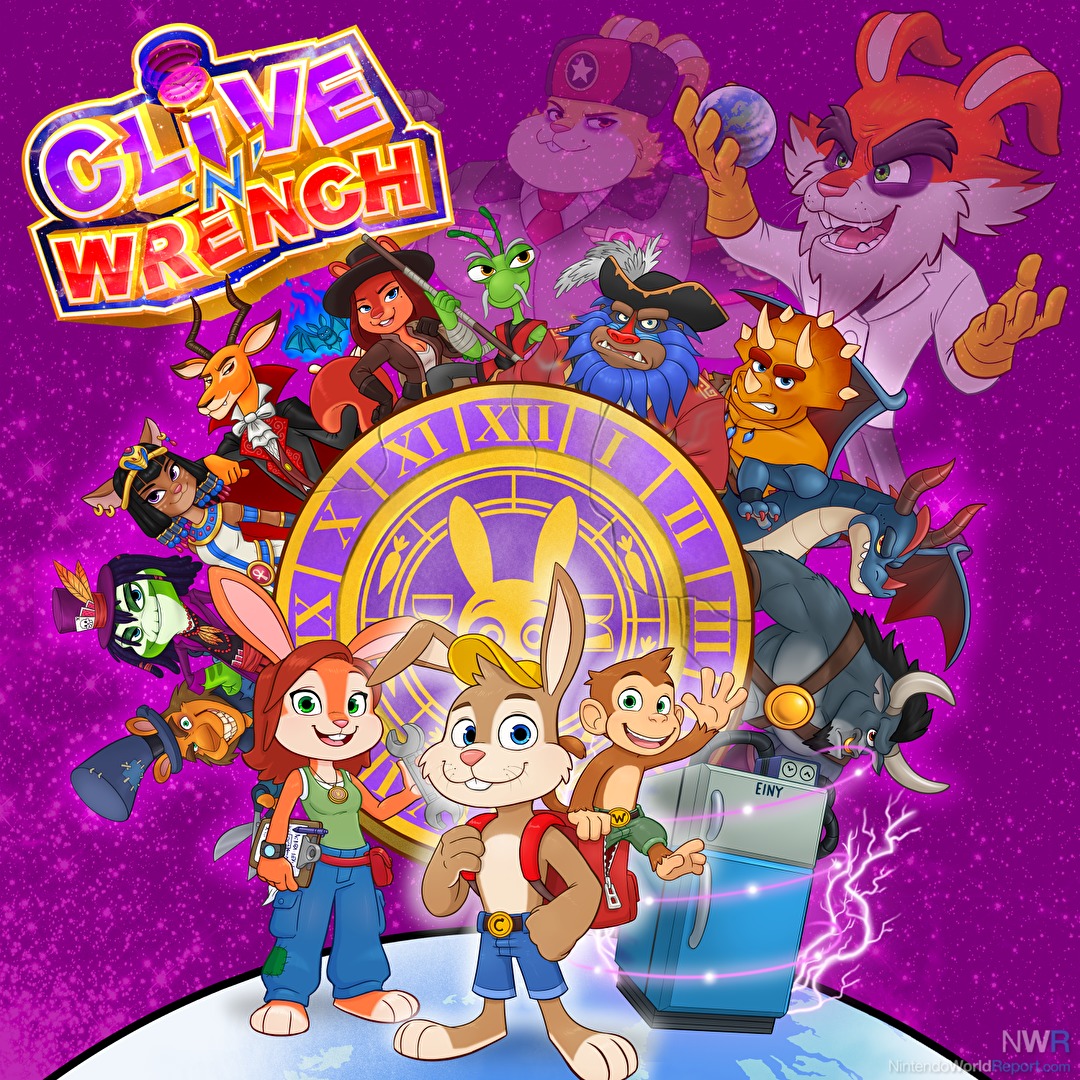
Clive ‘N Wrench sees you controlling the titular characters on a quest through time and space to stop the evil Dr. Draucus, who has been traveling throughout time to spread his evil elixir and gain world domination. Thankfully Clive’s sister Nancy has created a time-machine which enables you to travel to the past, collect pocket watches to fix the space-time continuum and stop the evildoers that have aligned with the Doctor. The game began development over ten years ago by a single developer, Rob Wass. The game is pretty packed with content, there’s an abundance of worlds to explore with each one designed after a different time period or theme. On the surface it truly feels like one of the 3D platformers from the golden age at the tail end of the 90’s and 2000’s when character platformers were everywhere.
The thing about character-based platformers is that usually they rely on their characters to a certain extent to keep the player engaged. Yes, franchises like Mario and Sonic had a bit of an advantage, making their jump to 3D after their characters were long established, but especially for the wave of 3D platformers that came after them, character was everything. I don’t think that series like Crash Bandicoot, Banjo-Kazooie, Conker and Rayman would have been as successful if not for their unique design and personality. Clive ‘N Wrench really feels as thin as paper in this sense. While the worldbuilding and designs are fine, during gameplay there is very little to make you feel attached to Clive, Wrench, Nancy and any of the other supporting characters that show up. The one exception might be the bosses, who each get a dedicated cutscene before you engage with them, but even then there is a real lack of explanation of why they are involved in this. The entire setup of the world and the reason for events happening feels like an afterthought, and what does not help is that the cutscenes in particular are rather horrendous to look at. Lots of exaggerated movements that are designed to come across as cartoony feel still and slow and lack the dynamic range that conveys a connection to the player. That’s not even speaking of the writing and text boxes which simply pop-in and dump the same text every time you engage with them. I was especially annoyed when I returned to the main hub world after clearing four worlds and Nancy would still say that I should go to the ‘orientation’ level to learn how to control Clive and Wrench. It made me lose interest in the world and character very quickly.
Of course, mentioning the story for a 3D platformer isn’t doing the game justice. Because what truly matters at the end of the day is how these characters control and feel while playing them. In terms of pure control I think that the best point of comparison would be a game like A Hat in Time, but feeling a tad more floaty and a bit more imprecise in its execution. Aside from the standard jump, double jump, spin-attack, ground pound and ‘helicopter whirl’ (using Wrench as the literal helicopter), there is very little that sets apart the moveset of the main characters. There is a super jump that can be executed as either a backflip or by holding the R-button. It feels slightly too overpowered, but can be combined with the double jump and the helicopter whirl to traverse long distances. The real issue is in how controlling the characters feel. Oftentimes the game comes across as too sluggish, where you really can’t gauge well if you’ll actually make a particular jump and at what point you should try to find a safe landing spot. There is the implication that you can combine a sort of slide jump to gain speed, but it never felt particularly satisfying.
That is before you even consider the level design, which mostly feels restrictive due to the levels being broken up into several segments.While I like the theming and attention to detail in these worlds there are some weird structural decisions that hamper the experiences. In each level you go around and find upwards of ten ancient stones (the power stars of this game). Most of them are achieved by helping characters with particular quests or finding them scattered around in the level. The real issue is that there really isn’t that much variety in gaining them. Catch the running rabbit? You get a stone. Do a ground pound on a particular button? Obtain a stone. Destroy X amount of objects? You get a stone. Of course, games like Super Mario Sunshine have similar structures, but because of the way levels are set up, the repetitiveness of the game really gets in the way of making these quests enjoyable. It also means interacting with characters and as stated before that gets quite tedious. I think what really could’ve helped here was if levels weren’t restricted to you finding a set amount of ancient stones to allow you to beat a boss and only after beating them unlocking the next world. This game is very lineair in that structure, and while that isn’t a problem on its face, it does mean that you will need to both explore each world at least until you’ve found enough stones and beat the bosses of each world, which are locked behind a specific stone requirement. Also the bosses just suck.
The bosses are some of the most disappointing I’ve faced in a game. They can’t be tackled out of order, and the first one you’ll encounter is incredibly difficult. It feels much like a Crash Bandicoot boss where you need to position yourself around the stage to make him throw scissors at ropes that make an anvil come down on its head. The problem is that unlike a boss in a Mario game, you aren’t locked to a 2D plane, but are still dealing with movement in 3D. This means you can still jump off the platform without meaning to, while projectiles are shooting all around you. There are also no health pickups in this boss fight, so if you inevitably lose, the boss fight immediately resets, giving the player far too little time to respond to the game-over and getting stuck in a pretty frustrating loop. The other bosses don’t fare too well either, with each having their own gimmick, but doing very little to justify the hardship you have to deal with as a player. They are just incredibly sudden difficulty spikes and while I am a seasoned player, I cannot fathom younger players enjoying these boss fights and not having a way to get past them to experience other levels.
I should clarify that I do not think that Clive ‘N Wrench is unplayable. The game is fine, but on Switch it looks really really bad. At times you could be mistaken that you’re watching an actual GameCube game, because of the stiff animation, the terrible draw distances in particular in the larger stages and the way models and lighting interact with one another. When I saw the first footage of the game in action a few years back, I was really impressed with the way it was turning out, but this Switch version is really a downgrade in almost every possible sense. The one thing I will say for it, is that the game runs at a stable frame-rate. Ignoring pop-in, animation, the lack of shadows, proper lighting and just very back looking character models, that is something going for it. Really, if you crave portability the game sure functions and may be fun for a few pick up and play sessions, but I think that this version doesn’t do any justice to the design and intent of Clive ‘N Wrench.
And I think that that is what stings the most. Because even while I felt mostly nothing while playing Clive ‘N Wrench, I did get a sense that this was truly a passion project from a single creator. This game is just the biggest swing and it’s a shame that it is mostly a miss. You can sense that there was so much care and design put into the game and its worlds. But it almost feels like it is cracking under its own weight from the very beginning. As if levels that were designed ten years ago are still part of this game, even though they fully exemplify why Clive ‘N Wrench is not a lot of fun to play. Worlds are either too big or too cramped. Characters are stuck in the same eternal loop while engaging with them in the level and show no growth. There’s no way to expand your moves and actions or any power ups to change up the gameplay. There’s a neat way to detect if you’re missing pocket watches, but there’s no reward in a level for finding them all, making them feel pointless. Clive ‘N Wrench attempts to revive the 3D platformer, but ultimately shows how the trappings of the genre made it die in the first place. All around while exploring levels, it feels like there is a lack of focus. A wish to perform like a jack of all trades, but ultimately barely mastering the fundamentals of proper movement in a 3D space. I do not think that this game is entirely bad or a complete mess, but it is the missed potential that stings. It is a plea to sometimes take a step back and fundamentally understand what your work should be about. Sure, there is enjoyment to be had, but much like a fast food meal I will not be thinking about Clive ‘n Wrench much in the future.


