Reforged launches on PS5 Sept 19 – PlayStation.Blog

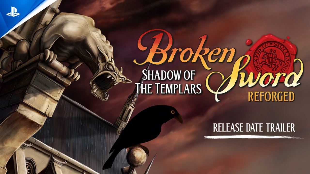
Many of the Broken Sword fans that I meet today first discovered the series in 1996 when a demo of ‘Broken Sword – the Shadow of the Templars’ was included on the Official PlayStation magazine’s cover-mounted CD. I am thrilled that subsequent Broken Sword games have continued to be hugely popular on PlayStation platforms.
A year or two ago, encouraged by enthusiastic fan communications which have continued over the thirty years since then, I decided that the time was right to undertake a substantially enhanced version of the game for PlayStation 5. We would redraw all the graphics in 4K – over 50 times the resolution of the original PlayStation version, and I was determined to ensure that the adventure gameplay felt utterly contemporary for a modern PlayStation audience.

With over 100 backgrounds, and 30,000 sprites (animation frames) creating this enhanced, or Reforged, version was always going to be a huge undertaking.
The original backgrounds were hand drawn in pencil on A5 (or larger) sheets by extraordinarily talented layout artists who had worked for most of their lives at the Don Bluth animation studios in Dublin. I decided that the game’s ‘canon’ should be those original pencil layouts, and where the game screens varied for whatever reasons, we would base the new high resolution art on the pencil layouts. This allowed us to digitally repaint over the original linework in 4K, which we had scanned at very high resolution, with confidence using the original game screens as reference.


This does mean that there have been some changes where the original digital colourist took shortcuts – for example in a Parisian Museum, the layout artist had originally drawn a sphinx, but the colourist then chose to save time by using an image of a goddess – probably adapted from a photograph. The high resolution game screen now includes a sphinx as originally intended. We did get caught out once or twice where we painted background elements from the original pencil layout, only to find that dialogue lines referred to a different image that had been changed by the digital painter. In 4K there is now scope for so much more detail, which makes the backgrounds feel really crisp and visually exciting, and enhances the gameplay experience as players can better see what is relevant for solving puzzles.


Character animation sprites were redrawn, referencing the original character sheets to bring to life details that were just a mush of pixels in low resolution. Each sprite has taken our talented team of animators up to an hour to draw – often needing to improve animations which looked fine in low resolution, but didn’t look so good when viewed in high resolution. But it’s been absolutely worth it – it is wonderful to see super smooth animations, with subtle facial animation and expressions which look to the quality of a great adult animation.


We decided to undertake user testing early in development to determine how well the original point and click interface, and the whole user experience, would be received by a new generation of players. Whilst the reviews for the games both in the press and from users are consistently excellent, we found that some new players were confused by the interface, and found the gameplay frustrating when they got stuck. That caused us to take a radical rethink to our approach. Whilst the original Broken Sword had hugely innovated in the genre in the ‘90s (the control system used by most adventure developers is now named the ‘Broken Sword’ interface because this is what they are copying), it quickly became clear that it was time to innovate again – some younger players simply weren’t attracted to a gameplay experience that for many adventures simply hasn’t significantly changed over 30 years. People play adventure games because they love solving puzzles which drive the story forward and we were determined to ensure that the gameplay experience delivered a wonderful feeling of achievement. So we reviewed videos and comments from those users, and re-designed elements that they got snagged on. We iterated and sent back out for testing numerous times, and found that each time the user scores climbed until we were receiving the high user scores that we had originally hoped for. Certainly the HUD and user experience now feels much more innovative and contemporary. All the time we very much kept in mind that many people love the original approach, so we offer the player a choice between the traditional approach and a new story mode.
I hope that you enjoy this new version of the original game, Broken Sword – Shadow of the Templars: Reforged. We have built on a game that was hugely popular when it was originally released in 1996, has retained a passionate following since that time, and can stake a claim to be one of the most popular adventure games of all time. I am very proud of our incredible team who have carried forward the passion and dedication to produce a game that delivers everything that the original did, and so much more, in 4K.


