Game analysis: The evolution of hypercasual runner Jelly Run 2048 | Pocket Gamer.biz
Back in 2021, Goolny Games was a small team of 10 working on various prototypes to show publishers. The team approached Azur Games with its cube runner game Jelly Run 2048, and while the game had a fun concept, the metrics needed to hit the desired mark.
In this guest post, Azur Games producer Milana Gelmanova details how Jelly Run 2048 first came to them and what measures were introduced to evolve the game from its original state into something ready for a successful launch with healthy projections behind it.
As 2021 came to a close, the team at Goolny Games approached us at Azur Games, armed with a prototype of a hypercasual runner. Although the game metrics were barely scratching the surface, they were hopeful. We aimed to bring the project to breakeven and then shift gears to our next venture.
Fast forward six months, and the reimagined Jelly Run 2048 was not just a part of Azur Games’ tier-1 hypercasual projects but also boasted 22 million installs and continues to scale.
In this article, I join forces with Siarhei Sadouski, CEO of Goolny Games, to unveil the behind-the-scenes narrative of the project’s evolution and how adapting to changes mid-journey can be the game changer.
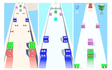
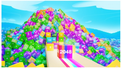
Jelly Run 2048 is a hypercasual runner game where players have to match cubes while dodging obstacles. With its deceptive simplicity and intricately designed levels that demand precision in calculating and arranging cube values, it promises an engaging experience.
We liked the initial prototype and decided to put it to the test, keeping an eye on the early metrics:
- US: R1 34.1%, R7 5.9%, CPI $0.78
- Worldwide: R1 38.5%, R7 7.0%, CPI $0.04
The R1 looked promising, comfortably around the acceptable 35% mark, but the R7 fell short of the minimum 7-10% range in the US. The CPI in the US was higher than the standard $0.5, clocking in at $0.78, although the global figure was much better. However, playtime was the lowest metric – about 3 or 4 minutes.
Individually, these metrics were just scraping by, and some didn’t even meet the minimum thresholds. Despite this, we saw potential in the project and took it under our publishing wing. We had faith in the team, the project, and the belief that we could collaboratively steer it towards a successful launch.
“Prior to the full-scale release of Jelly Run, our studio had been operational for about a year. We’re a small team of 10. During that first year, we experimented with prototypes, toyed with various genres, and sought one that we’d enjoy working with.
In total, we tested around 20 prototypes with different publishers, but none hit the scalability mark. We had even tested the project with other publishers and completed several iterations. But things didn’t pan out for various reasons. That’s when we approached Azur Games.
Despite our previous setbacks with other publishers, we considered the first test to be a success. It broke even and instilled a sense of optimism in us, reassuring us that we were on the right track,” shared Siarhei Sadouski, CEO of Goolny Games.
The journey of completion, spanning six months
We embarked on this project in December 2021, but the final release only saw the light of day six months later. While we had initially aimed for a release in just a couple of months, our plans evolved along the journey.
In the early stages, every aspect of the game underwent meticulous discussions. Now, we’ve streamlined the process down to a single weekly sync. The division of tasks followed the typical pattern for such collaborations: the studio handled the development while we focused on marketing and advertising. We jointly navigated the planning and roadmap phases, with each party contributing ideas, adjustments, and feedback. This strategy truly shone during the first pre-release updates.
One glaring shortfall in the game’s first version was the lack of content – it only included 10-15 levels. We knew we needed to introduce way more levels, and the challenge was steeper than anticipated.
“Jelly Run 2048 presents a complex level design despite belonging to the hypercasual genre. It’s not designed for a broad hypercasual audience in the conventional sense.
We invested substantial time in developing intriguing yet simple levels. Additionally, every level is manually created and integrated into the game – we have no random or automatic generation. Whenever a new mechanic is introduced, we adjust the balance and position the new features at the start of the game to let new players familiarise themselves with them.
On the bright side, the intricate design has deterred the emergence of game clones, as it’s not easy to copy,” said Siarhei Sadouski, CEO of Goolny Games.
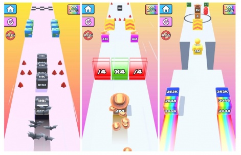
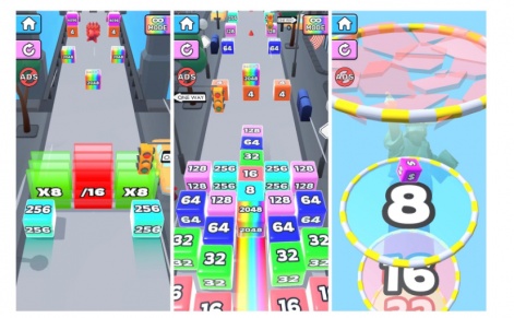
Simply adding more levels wasn’t enough; we needed to incorporate new mechanics to maintain player interest and ward off monotony. Initially, the game included only spikes and thorns; later, we introduced pits, multiplier cubes, and other obstacles.
At one point, we implemented a popular marketing creative feature – a classic gateway that either increases or divides the cube by 16 as it passes through.
While some obstacles don’t directly impact the gameplay (like a springboard), they offer visual variety without incurring significant production costs. For example, spikes and thorns exhibit the same properties but differ in appearance. Later, we added diverse elements such as moving plates, rotating blades, and a spiked cylinder that moves in a circle.
Each iteration where we implemented more levels and variability added anywhere from 0.5 to 2 percent points to retention. Such updates were a regular occurrence for us.
Hard levels
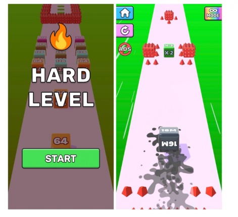
The idea of introducing hard levels came next, leading to a metrics boost. From a design perspective, these challenging levels were no different from the regular ones, except for a slight variation in colour and the distinctive “hard” label.
It’s a testament to the fact that you don’t always need to invent new mechanics. Sometimes, simple visual changes can suffice.
“Now that we’ve honed our level design skills, we create and adjust levels much more quickly. We rely primarily on past experiences and test data: where players would exit, at what level, at what specific point, and so forth. To streamline the process, we’ve even created a document to track changes at every level, making it more visual,” says Siarhei Sadouski, CEO of Goolny Games.
UI
The UI required a refresh as well. We worked towards a unified style, eliminating clutter and tailoring the buttons to a more casual gaming style. Additionally, we fine-tuned the colour palette and generally decluttered the visuals.
The redesigned interface improved almost all aspects except for one specific rewarded ad placement. The button looked sleeker to us but was less noticeable to players. We had to make it stand out by giving it a flashy and bright appearance. This aspect required several iterations, as it directly affected the user experience.
As the project progresses, we’ll keep tweaking and optimising the interface for the new user flow.
Monetisation
The monetisation aspect demanded significant attention too. The initial version of the game lacked rewarded videos, which we recognised as a valuable opportunity. The most straightforward solution was to place bets on the respawn button following a loss, which significantly boosts player satisfaction. The player gets a die with the maximum value and clears the level, while we benefit from increased ad views – a win-win situation. That’s precisely what we did.
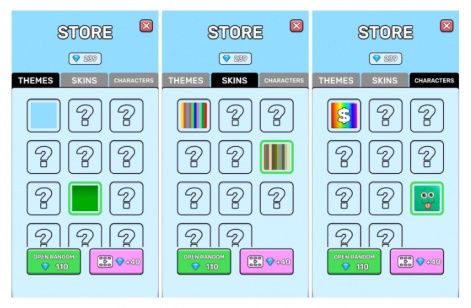
As the project expanded, new reward points were introduced. For instance, players can now increase the value of the starting cube, double the number of diamonds after completing a level, or initiate a bonus level. All these features alternate – one placement for rewards, another for diamonds. We continually review the analytics and keep experimenting with placements. We also added a fully stocked in-game store featuring in-game backgrounds, cube skins, and character skins for the finish screen.
“By the time of release, the project had transformed so much that it almost felt like a new one. The changes were extensive – we expanded the number of main levels, added hard levels, incorporated diverse mechanics, refreshed the visuals, and improved monetisation and ad placements. The content was significantly richer, even though we had already planned out a feature roadmap for the upcoming month,” shares Siarhei Sadouski, CEO of Goolny Games.
With these improvements, the metrics saw a slight increase, and the project began to break even steadily:
- US: R1 36.5%, R7 10.5%, CPI $0.4
- Worldwide: R1 37%, R7 10.5%, CPI $0.5
- Playtime has reached 7-8 minutes by that point in time
While we primarily focused on improving the monetisation aspects rather than retention, this didn’t result in more playtime. However, the game now had more ad placements without compromising user experience. We were aware of the game’s untapped potential. It simply made no sense to abandon it and move to another project. Scaling it up was the logical next step.
Adjusting plans and scaling up
We chose to adhere to our roadmap: introducing new levels, obstacles and refining not only the core gameplay but the peripheral aspects as well. Our approach was to test each feature first, then polish it over 2-3 iterations or simply discard it if it didn’t work. Consequently, each update provided an incremental boost to our metrics, a strategy we still follow.
Around this time, our initial strategy of “finish and move on to another game” morphed into “further develop and scale up the project.”
Bonus levels
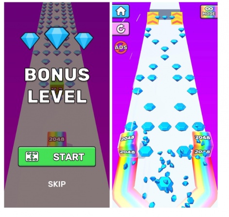
One of the first enhancements post-release was the addition of bonus levels. The game occasionally offers players a chance to watch a rewarded video and advance to a special level featuring only diamonds. For each bonus level, you can earn five times more diamonds than you would in a regular level. This little change boosted our retention rate by 0.5% and bumped up views of our rewarded ads by 25%.
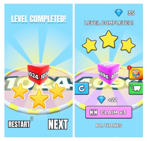
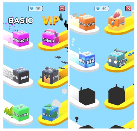
We then introduced a collectable element into the game, with a skin showcase where each cube with a new value after 4096 lands. Additionally, we launched VIP cubes featuring unique skins and an animated trail. Players unlock these VIP cubes in exchange for diamonds or watching ads, and they instantly come into play. They add a visually appealing touch and make the game more vibrant.
“We structured it like a classic battle pass, featuring both free and premium versions,” says Siarhei Sadouski, CEO of Goolny Games. “On the left are regular skins that unlock automatically, while the right features VIP skins that require manual unlocking. As a result, players have visible progression and new motivation to unlock all cubes.”
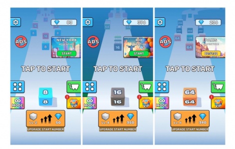
Concurrently, we introduced a feature allowing players to increase the starting value of the cube, thereby tying it to rewarded videos. Instead of starting with a ‘2,’ players now start with, say, a ‘256.’ As a result, we can increase the maximum cube value at each level and expand the overall skin collection. This feature primarily caters to long-term players, focusing on extended gameplay and progression. In later stages, cube values will be in the billions or more.
Endless mode
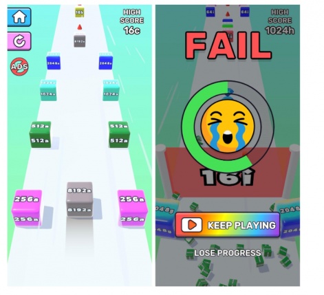
We introduced an endless mode to cater to players who enjoy competition and high scores. It’s essentially a level featuring a standard set of mechanics divided into sectors. Each sector is demarcated by a gate with a specific cube value that players must reach to progress. If they fail, they either start over or watch rewarded videos to continue.
This update resulted in a significant boost as well. It added 30 seconds to the average playtime, boosted retention by one percentage point, and increased LTV by 10%.
Additionally, this serves as a great example of how our gradual feature polishing process works. Initially, we made this mode available to experienced players. As we further developed the feature, we gradually moved it closer to the beginning of the game – it’s now accessible after level 7. Concurrently, we cautiously introduced more ad placements, such as rewarded ads for losses and interstitial ads when passing through the gate, and amplified the overall complexity.
“Endless mode is designed for players who crave more challenges,” says Siarhei Sadouski, CEO of Goolny Games. “We’re enhancing what we initially wanted to introduce. We plan to include online leaderboards to further spur competitiveness.”
Events
Our latest significant feature is events – a set of ten levels that follow standard mechanics. Upon completing these levels, players receive 300 diamonds. Each event occurs in a unique setting, like New York, Paris, or Rio de Janeiro.
While the core mechanics remain the same, the visuals differ greatly, providing players with a unique gaming experience. The levels aren’t just empty but adorned with buildings, sidewalks, traffic lights, trees, etc. Furthermore, the finishing animation features a city’s main attraction, like the Statue of Liberty, for added appeal.
The events really helped our metrics across the board. On average, playtime increased by 30 seconds, retention rates rose by 0.4 to 0.5 percentage points, and each player viewed about 0.3 more ads, both rewarded and interstitial.
Encountering failures
Although most of our features are successful from the get-go or after 1-2 iterations, not all have been successful. All basic features can work; the question is how well you implement them. In our case, aspects like skins, levels, endless mode, and events – typical in mobile gaming – were adeptly implemented.
Yet, some updates didn’t go as planned, leading us to roll them back completely. Some were incompatible with our game’s design, while others were beyond our capacity.
Meta
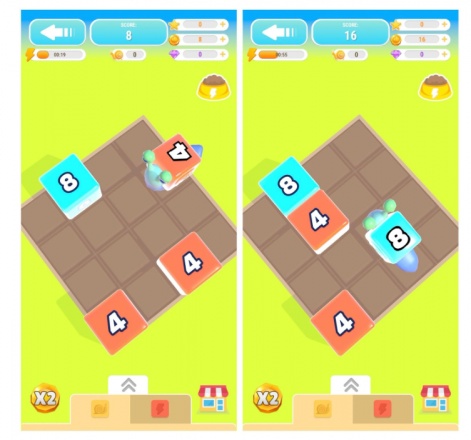
We tried incorporating a meta, specifically an idler, on the finish screen where the player’s dice fall. We designed a field where a snail would gather these dice. Though we implemented this quickly, we foresaw it wouldn’t resonate with our players – and we were right. The meta didn’t have any discernible impact on the metrics.
Considering the meta needed revamping, we removed it altogether and allocated resources to higher-priority features that would benefit the game’s growth. We typically brainstorm and test a new hypothesis at least every 1-2 weeks, so a meta-overhaul would derail our schedule.
With all main features now implemented, we’ve revisited the meta concept.
New controls
We also tried to introduce a new control mechanism. Originally, the cube was split by tap or swipe into a fixed position. We added a second option – smooth scrolling – which allowed players to manually adjust the width of the cube split, offering multiple positions. However, our levels weren’t adapted for this control style, so we scrapped it. Revisiting it would require a complete level redesign, which isn’t feasible.
Finish animation
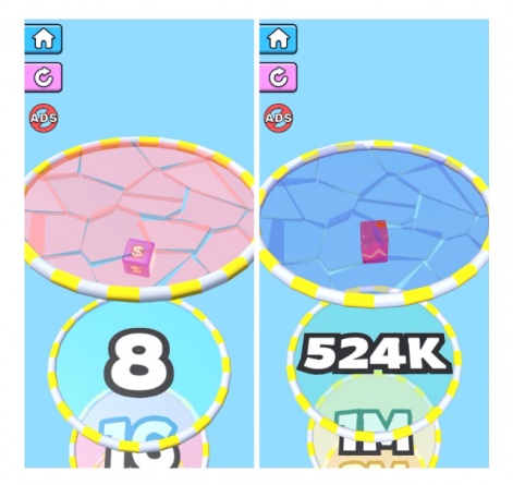
“In terms of unique challenges, we faced issues with the finishing animation. At each level’s end, the cube falls through multiple rings. The higher the cube’s value, the more rings it passes through, lengthening the animation and consuming precious playtime. At advanced levels, the animation becomes excessively long to the point of annoyance. We didn’t even like that ourselves.
We tried to remove it, speed it up, decrease the number of rings, adjust the distance between them, etc., but every attempt negatively affected our metrics. Surprisingly, players seem to enjoy this, finding it calming. In future updates, we plan to test an accelerated animation and skip buttons,” says Siarhei Sadouski, CEO of Goolny Games.
What’s next
We don’t anticipate seeing peak metrics anytime soon. Although each update steadily scales up the project, the impact isn’t starkly reflected in the metrics due to the gradual nature of the growth.
We have more than 25 features in the pipeline. Among the significant ones, a new meta is the closest. As for minor improvements, there are numerous tasks to tackle. We aim to better synchronise the endless mode and events, specifically their duration, appearance, and timings.
Our focus also lies on enhancing the monetisation aspect. We’re testing in-game ads, planning to integrate audio ads, and exploring offers for ad disablement, diamonds, VIP cubes, etc. We have a lot on our plate, and we’ll tackle these tasks one at a time.
“Our efforts are not limited to Jelly Run 2048. Alongside this, we’re working with Azur Games on prototypes, aiming to identify a new idea and iterate upon it,” says Siarhei Sadouski, CEO of Goolny Games.
Edited by Paige Cook

